 Send Email

|
Authors | Institution |
|
Bruno Moelgaard Geertsen Christian Balslev van Randwijk |
University of Southern Denmark |
 |
|
||||||
| Using Dashboards as platforms for student evaluations |

Effective decision-making is based on having the right information available and easily accessible.
Dashboard-type software, such as QlikView, provides a centralized knowledge base for evaluations of teaching, allowing for a smooth and continuous operationalization of information gained from student evaluations.
When building dashboards, it’s important to follow simple but effective design methods, emphasizing important data. This ensures easy access to key metrics for otherwise busy users.
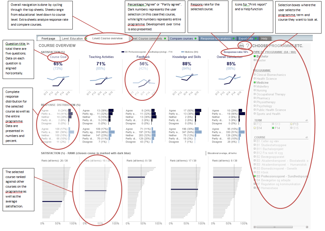
At the Faculty of Health at UoSD, we are in the process of implementing QlikView, a dashboard type software, as a digital platform for gathering all student evaluations of teaching and learning activities at the faculty.
In every course evaluation since September 2012, the students have been asked to answer the same five questions (rated quantitatively) together with the students' qualitative comments on each course. Data are gathered using the online questionnaire system, SurveyXact, and the results are then uploaded to a dashboard in QlikView.
In its implementation at the Faculty of Health at UoSD, QlikView is set up to show both the quantitative (student satisfaction) and qualitative (comments) knowledge in the dashboard.
The dashboard follows well-known academic design principles, such as data-ink ratio (extreme graphical focus on the data - Stephen Few: Show Me the Numbers) and positioning of data on the dashboard (top right corner is prime real estate - Stephen Few: Information Dashboard Design). But it’s also build from years of experience with in-house management information as well as ongoing communication with dashboard end-users (teachers, educational leaders etc.).
Key features of the dashboard includes:
-
Multiple dashboard sheets with different functions and levels of detail
-
Multiple selection boxes on each sheet, where the user selects programme, course and term
-
Consistent sheet design concerning color theme, types of charts, placement and presentation of key metrics etc.
-
Multiple comparisons for each key metric, for example vs. development over time and comparison to other programmes/courses.
Student evaluations play an important role in quality assurance and quality improvement of teaching and learning activities, and in aligning these with overall educational policies, at the University of Southern Denmark (UoSD).
Making knowledge gained from student evaluations more accessible is an important step in paving the way for a more streamlined operationalization of both summative and formative knowledge. This is true for both quality assurance and quality improvement of teaching and learning activities.
For both individual teachers looking for constructive feedback on their recent teaching activities, and managers and administrators assessing quality and trends in teaching at the faculty over time, a dashboard-type solution, such as QlikView, is an efficient and transparent platform.
When building a dashboard it’s important to follow simple, but effective design methods to emphasize important data. Furthermore it’s good practice to take any constructive feedback from dashboard end-users into account for future dashboard development.
Litterature:
-
Stephen Few - Information Dashboard Design: Displaying data for at-a-glance monitoring, Second Edition
-
Stephen Few - Show Me the Numbers: Designing Tables and Graphs to Enlighten, Second Edition
Links:
-
QlikView software: http://www.qlik.com/
-
SurveyXact software: http://www.surveyxact.com/
-
Perceptual Edge: http://www.perceptualedge.com/